Red States, Blue States, Fat States, Dumb States ... Some U.S. Maps to Consider During this Election
Through this whole election cycle I've often thought 'who the hell would really vote that way?' (for example, when West Virginia voted for Hillary over Obama by something like a 5 -1 margin). But after the primaries were all settled I let my mind focus on other things for a while. Like how Mets manager Jerry Manuel looks like he should be playing clarinet in a smoky jazz club, or how Michelle Obama looks like an odd cross between Sigourney Weaver and Emmanuel Lewis. But now that we're getting close to crunch time and I see Palin's vacuous head filling my TV screen far too often, usually making some close-minded, ill-informed comment in her uniquely smarmy fashion, I have to ask myself -- nay, I ask America -- who the hell would really vote for McCain / Palin?
So I did a little looking around to see what else I could learn about the states that are leaning toward the McCain / Palin ticket. Below is a bit of what I found. I realize that tracking this information at the state level is far from ideal. Chicago holds little in common with Carbondale, for example, other than being in Illinois. But getting this kind of data at the county or congressional district would take forever and I have already spent way too much time on this. That said, take all these observations with a grain of salt.
Note: In all instances, McCain / Obama polling data is from USA Today's Presidential poll tracker. Also, clicking on the images will let you see a larger version of it over on Photobucket.
Education
First, from the US Census, a chart mapping attainment of at least a Bachelor's degree by state.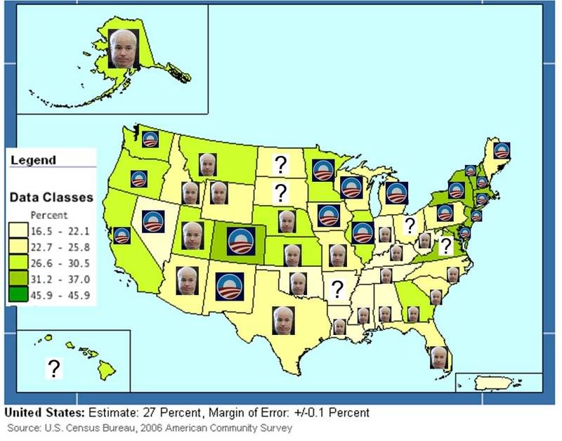
Of the 27 states where less than 25.9% of the population holds a Bachelor's degree:
McCain - 16
Obama - 7
TBD - 4
If I were a betting man I'd say this will end up either 18 - 9 or 19 - 8, McCain
Of the 23 states where more than 26.6% of the population holds a Bachelor's degree:
McCain - 6
Obama - 15
TBD - 2
This will likely go 16 - 7, Obama. If northern Virginia goes heavily Obama, maybe it goes 17 - 6.
Mobile Homes & Trailers
Next, also from the US Census, a look at % of homes that are either mobile homes or trailers.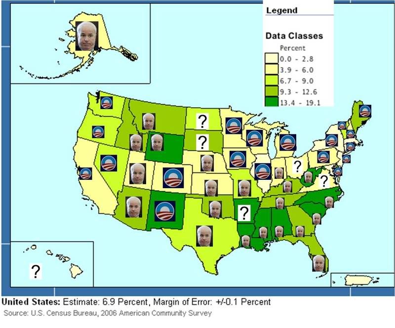
In the 26 states where more than 6.7% of homes are mobile homes or trailers:
McCain - 17
Obama - 6
TBD - 3
And it's looking like this will end up 20 - 6, McCain.
In the 24 states where less than 6.0% of homes are mobile homes or trailers:
McCain - 5
Obama - 16
TBD - 3
Likely to go 17 - 7 for Obama, maybe 18 - 6 Obama.
Obesity
Next, from Strange Maps with data from the CDC, we look at a map that illustrates relative obesity rates.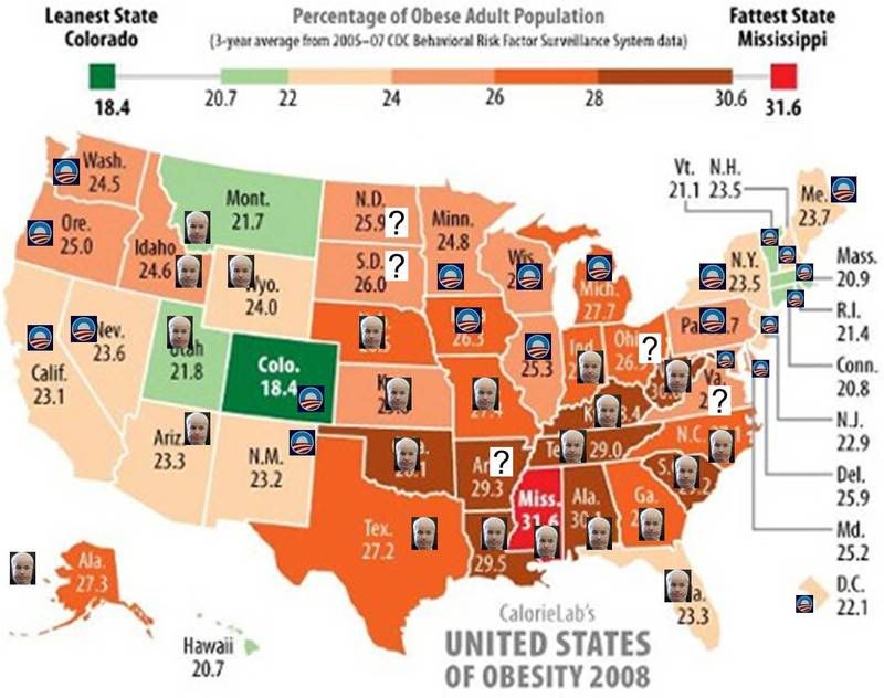
Among the 32 states with obesity rates higher than 24%:
McCain - 17
Obama - 10
TBD - 5
Likely to go either 22 - 10 or 21 - 11 McCain.
Among the 18 states with obesity rates lower than 24%:
McCain - 5
Obama - 12
TBD - 1
Likely to go 13 - 5 Obama
"Values" - Divorce & Teen Birth Rates
Taking a quick look at some "values" issues, I found a couple of charts over at Talk To Action using National Center of Health Statistics data that illustrated divorce rates and teen birth rates. 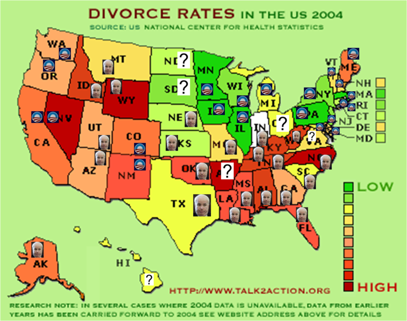
Surprised to see so many of the green, low divorce rate states skewing toward Obama, the guy who "doesn't see America the way you and I do" (according to I'll-say-anything-because-I'm-nothing-more-than-an-empty-vessel-with-an-extremely-narrow-and-inflexible-world-view Sarah Palin).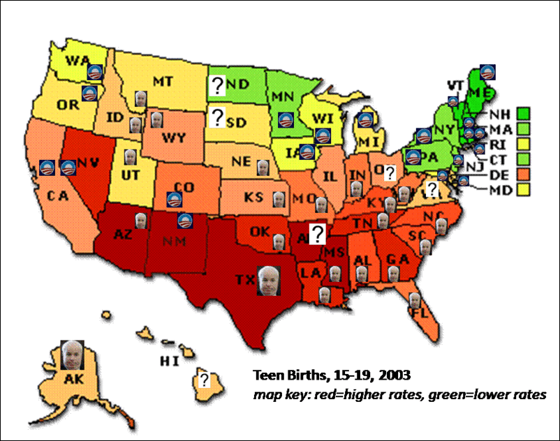
Interestingly, Obama also seems to be carrying more of the lower teen birth rate states. Weird, huh? Thought Republicans owned "values".
Religion
I also found a couple of maps that illustrated the degree of religiousness and the type of faith that is most common by county. I am far from being an expert on religion, but it did seem to me that a few relatively major religions were absent (say, Judaism, Islam, Hinduism, Buddhism). These defy neat tallying like the earlier charts, but, nonetheless, I had the maps, the Obama logo and the McCain head, so I plotted these, too. Seems like there is some correlation (or just some pretty strong coincidence) of high divorce rates, high mobile home ownership, high teen birth rates, high obesity rates and intense religiousness. And they all like McCain/Palin. 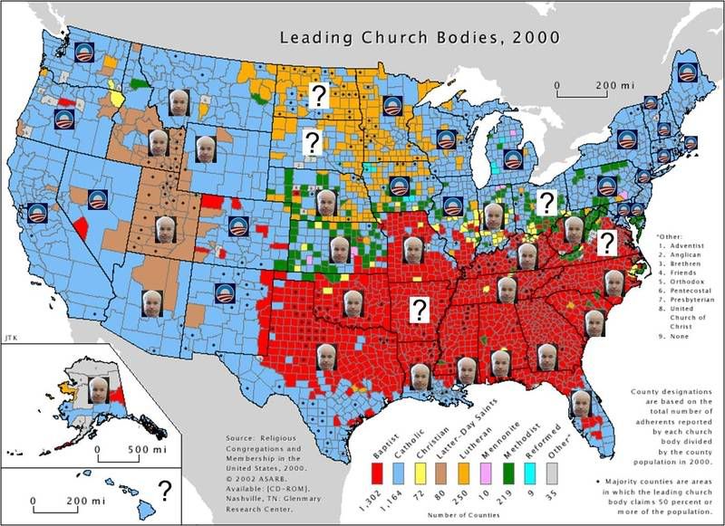
Map source: Strange Maps.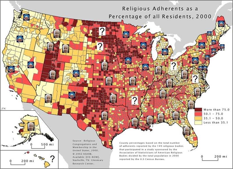
Map source: The Daily Irrelevant.
The Legacy of Slavery
And I also found a map of state/territory slavery policy from pre-Civil War times. Anyone who says race isn't a factor in this election is kidding themselves. Wow. 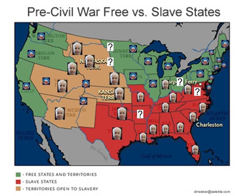
Finally, it's worth noting that while I was doing the research for this post I found that someone else, David Pakman, was doing similar analysis. He takes a couple of different looks at a similar concept, so check that out, too, if you're interested.
UPDATE 10/12/08: "We don't need no A-rab president"
Doing a little red state / blue state search this morning and one of the results I found the video below, posted by Andrew Sullivan. All your worst fears live and with pictures and sound - the wonder of YouTube, no?
ADDITIONAL UPDATE 10/12/08: Red State, Blue State, Rich State, Poor State
Looks like there is a lot of useful data and discussion over at Andrew Gelman's blog, which is a companion piece to his book, Red State, Blue State, Rich State, Poor State: Why Americans Vote the Way They Do.


|